
Jabel / David Connolly
Style Guide
07. Visual Assets
While brand consistency relies heavily on logo usage, color, and typography, we recognize that these are not the only elements within a brand identity design system. This section contains guidelines on approved visual elements such as iconography, textures, shapes, and patterns.
Iconography - Material Sharp Icons


Textures
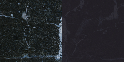
Photo Textures
These photo textures are to be used throughout the site and throughout other applications. When used as background textures, apply a color overlay of 80-90% opacity that matches the respective texture (Pale Pink for the Pink Marble, JABEL White for white marble etc.) They can be used with no color overlay in specific context such as the empty state on blog articles or as standalone textures. Do not place any elements on these textures without first adding a color overlay first.
These texture images are free to use stock photos from Unsplash.com.


Frosted Glass (Backdrop Filter)
For certain areas of the website and other applications, a special frosted glass effect was created to house text-based content on top of images and textures. This effect uses the CSS property “backdrop-filter” set to blur(80px) onto a container with a fill set to JABEL White at 60% opacity. The container can have a 1px border set in Alabaster depending on context. This effect is commonly applied to most cards on the website. The background image takes up the fulll height of the card while placing the card content on top. On card hover, the opacity should change from 60% to 90% to reflect a state change.
Not all browsers support backdrop-filter (FireFox, Internet Explorer). In such cases, just set the container to 60% opacity in JABEL White. Refer to the link below for more information.
Learn More >